In user interface (UI) and user experience (UX) design, we strive to create a visually appealing and user-friendly interface. However, it’s important to remember that not all users see colours the same way.
Around 300 million people worldwide live with colour vision deficiencies, commonly known as colour blindness, therefore ignoring this significant portion of your audience can lead to a poor user experience and exclusion.
In this post, we’ll explore the impact of colour blindness on users and discuss how we have taken steps to make our interfaces more accessible to everyone.
What is colour blindness and the different types of colour blindness?
Colour blindness, also known as colour vision deficiency (CVD) is a visual impairment that affects a person’s ability to perceive certain colours accurately. is not a binary condition, but instead exists on a spectrum. These conditions are a result of an absence or malfunction of specific cone cells in the retina, meaning it is hard to differentiate certain colours and although typically a genetic condition, it can be acquired as a result of certain diseases or injuries to the eye or brain.
Type 1: Red-Green Colour Blindness
The most common form of colour blindness is red-green colour blindness, where individuals have difficulty distinguishing between the colours red and green. There are four sub-types.
- Deuteranomaly: This type makes greens appear more reddish and is the most prevalent form of red-green colour blindness.
- Protanomaly: Similar to deuteranomaly, protanomaly also makes greens look more red.
- Protanopia: In this case, individuals are unable to differentiate between red and green.
- Deuteranopia: Individuals with deuteranopia also cannot distinguish between red and green.
Type 2: Blue-Yellow Colour Blindness
Less common than red-green colour blindness, blue-yellow colour blindness makes it challenging to distinguish blue from green and yellow from red. There are two subtypes:
- Tritanomaly: Tritanomaly makes it difficult to distinguish between blue and green or yellow and red.
- Tritanopia: People with tritanopia are unable to differentiate between blue and green, purple and red, or yellow and pink. Additionally, this condition makes colours appear less bright than they actually are.
Type 3: Complete Colour Blindness (Monochromacy)
Also known as monochromacy, complete colour blindness is exceptionally rare. In monochromacy, individuals see the world in shades of grey and lack the ability to perceive any colours.
Understanding these types of colour blindness is essentially for designing visuals and environments that accommodate individuals with colour vision deficiencies.
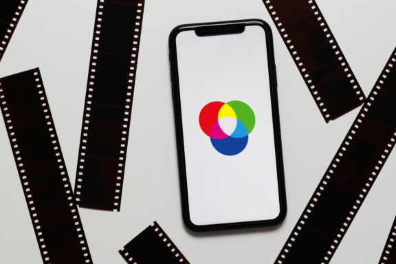
Royalty free image, explaining the difference between types of colourblindness/ an image from our XD file, where it is simulated.
How does design impact users with colour blindness?
When website and mobile app designers rely too heavily on colour coding or use colour as the sole means of conveying information, it can create significant barriers for colorblind users.
An example of this would be on a webform that uses red to indicate errors in form fields. A user with colour blindness may not register this as an error and continue to the next step without realising the mistake, resulting in a frustrating experience.
We saw this first hand, when creating a multiple choice quiz screen for our internal development project, Coderus Life. Simply showing correct / incorrect answers on the input buttons using just the colour change from blue to red, or blue to green wasn’t enough to clearly show our test users the outcome of each answer. Whilst there was some contrast between the colours, the addition of symbols to the cards (ticks and crosses in this instance) is what helped us to get around this issue.
How to design with colour blindness accessibility in mind?
- Colour Contrast: Ensure that there is enough contrast between text and background colours. Use online tools to check if your colour combinations meet accessibility standards like WCAG AA & WCAG AAA (Web Content Accessibility Guidelines).
- Colour Selection: Be mindful of your colour palette. Avoid relying solely on colour distinctions. Instead, choose colours that maintain clarity even when viewed in grayscale or with a colour filter applied.
- User Testing: Involve colorblind individuals in your usability testing. Their feedback can help identify issues and refine your design.
- Using Accessibility Tools: Implement accessibility tools and features in your design process, such as screen readers, keyboard navigation, and ensuring compatibility with assistive technologies.
You can also read our guide on Designing for Accessibility and Inclusion for more tips.
How does other software assist with colour blind specific accessibility?
- Apple iOS features a colour blind mode that adjusts the display to enhance visibility for users with colour vision deficiencies.
- Google Maps uses different patterns and shapes in addition to colours to represent various types of locations, making it accessible to colour blind users.
- Sim Daltonism is a colour blindness simulator tool which allows designers to see their designs as someone with a colour vision deficiency would.
Why is this important?
To wrap up, it is important to remember that accessibility in UI/UX design is not just better for users; it’s also a smart business decision. By making user interfaces inclusive and accommodating for colour blind users, you expand your potential user base and enhance the overall user experience.
Remember that accessible design benefits everyone, not just those with disabilities, and it should be a fundamental consideration in all your design projects, which is something that we strive to do at Coderus. By embracing these principles, we can create a more inclusive digital world where everyone, regardless of their visual abilities, can engage with technology effortlessly.
Get in touch with us today if you need assistance making your software or applications more accessible.


